Auto Slideshow for Image Hotspots

People like to push the boundaries of GoThru overlays, and we like to take the challenges. We've been asked the other day, to implement an auto slideshow play button, for the images in the hotspot gallery. The idea is nice ... but implementing the UI in the Editor takes time ... and it complicates it. So we decided to write some CSS code ;)
Preview:
Let's explain how it works:
1) You need to add the Code plugin, and in the Header section you need to add the below code (this sample is for 4 images):
<style>
@keyframes rotate-four {
  1% {
    -webkit-transform: translateX(0%);
  }
  12.5% {
    -webkit-transform: translateX(0%);
  }
  25% {
    -webkit-transform: translateX(-100%);
  }
  37.5%{
    -webkit-transform: translateX(-100%);
  }
  50% {
    -webkit-transform: translateX(-200%);
  }
  62.5% {
    -webkit-transform: translateX(-200%);
  }
    75% {
    -webkit-transform: translateX(-300%);
  }
    87.5% {
    -webkit-transform: translateX(-300%);
  }
}
}
</style>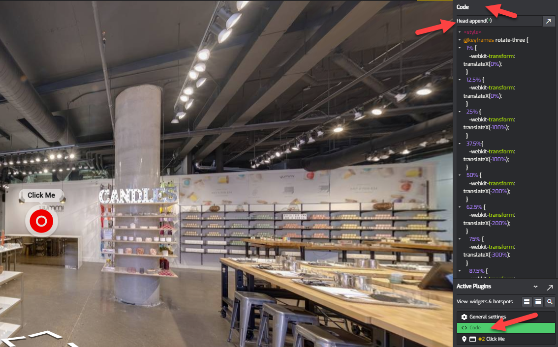
If you want to have a different number of images we need to change the above code.
Let's build the code for 3 images:
We first need to name the keyframe for the number of images that we have
@keyframes rotate-three { }We take the number of images (3) and multiple by 2 and then we take the resulting number and we divide it to 100 (from 100%)
So, in case our case the numbers would be
3*2=6
100%6=16.6 (this will be our jumping number, for each keyframe)
Then we add two lines, for the first image (one for the motion, and one for the pause on the panorama)
@keyframes rotate-three {
    1% {
        -webkit-transform: translateX(0%);
    }
    16.6% {
        -webkit-transform: translateX(0%);
    }
}
Then we add the next two, for the 2nd image, and we will keep adding our jumping number so:
16.6+16.6=33.2
33.2+16.6=49.8
@keyframes rotate-three {
        -webkit-transform: translateX(0%);
    }
    16.6% {
        -webkit-transform: translateX(0%);
    }
    33.2% {
    	-webkit-transform: translateX(-100%);
    }
    49.8% {
    	-webkit-transform: translateX(-100%);
    }
}
You will also notice that for the translateX we deduct 100 so it became -100%
Then we do the translation for the 3rd image, and we are keep adding our jumping number
49.8+16.6=66.6
66.6+16.6=83.4
and deduct another 100% so the translateX is now -200%
<style>
@keyframes rotate-three {
        -webkit-transform: translateX(0%);
    }
    16.6% {
        -webkit-transform: translateX(0%);
    }
    33.2% {
    	-webkit-transform: translateX(-100%);
    }
    49.8% {
    	-webkit-transform: translateX(-100%);
    }
    66.6% {
    	-webkit-transform: translateX(-200%);
    }
    83.4% {
    	-webkit-transform: translateX(-200%);
    }
}
</style>NOTE:
Now, if you have hotspots with 2, 3, 4, 5 etc number of image, you will need to create a keyframes for each of the number of images that you have
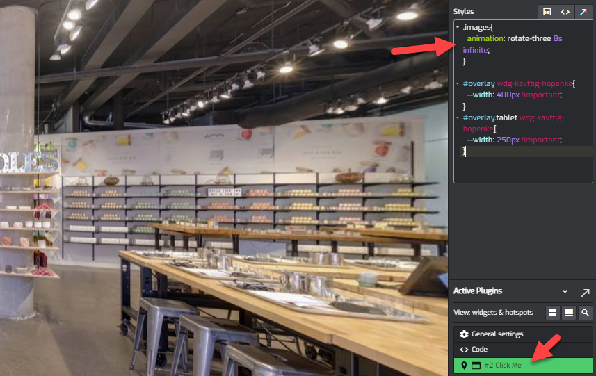
2) Open the Hotspot, and go to the Style section, and add the below line:
.images{
  animation: rotate-four 8s infinite;
}
This line reference the rotate-four, but if you've defined one for 3 you should reference the rotate-three or whatever number of images you have
Another important number is the # of seconds. In my case I've choose 8s but you need to test what works best for you, for the number of images that you have